web design is getting worse and worse
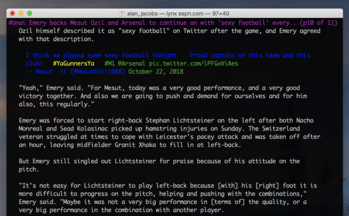
For instance, ESPN’s site is so ugly, so crowded, so impossible to navigate that when I really want to read ESPN stories this is how I’m doing it:

✝️ 📚 📖 🖊 ⚽️ 🏀 🎸 🎵 🎥
For instance, ESPN’s site is so ugly, so crowded, so impossible to navigate that when I really want to read ESPN stories this is how I’m doing it:
