bookmaking

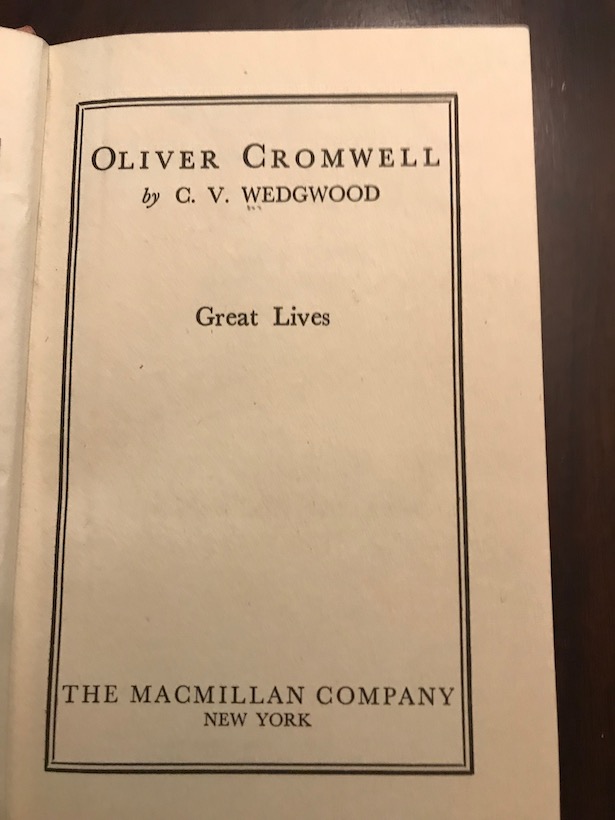
After writing my recent post on my enthusiasm for the writing of C. V. Wedgwood, I realized that I didn’t have a copy of her brief biography of Oliver Cromwell, so I ordered one from AbeBooks. It duly arrived, and I have just read it, and can report that it’s fine but by no means one of her best works. But I find myself thinking about the actual physical book, the codex.
It’s a discarded library book — from Stephens College in Missouri — and was acquired by that library in 1956. It’s a small book (4.5 x 7.5 inches) and has a basic, unadorned cover, and when I first opened the book I thought that the paper wasn’t great. But then I realized that the paper is sixty-three years old, and in that context it’s pretty darn good. It hasn’t yellowed much, and isn’t as brittle as paper that age often is. The binding is sewn, and the book easily lies flat.
Though the book, as you can see, was published by a New York house, it was actually printed in England.

The Jarrold Group sold their printing business around fifteen years ago, after which it seems to have closed, leaving only a small and rarely open museum of printing.
But in their day they knew their craft. It’s the typography that really struck me, even though it’s not unusual or obviously distinctive. Here’s a sample page:

As I say, not dramatic — but look at how lovely all the proportions are: the layout on the page, the spacing and kerning, the simple but elegant (and highly readable) typeface — Baskerville, I think — you can’t go wrong with Baskerville. It’s very rare for a book to get almost every element of typesetting and layout right the way this one does. (The kerning might be a tiny bit wide at times, but that’s because the book is small and the lines are therefore short. The compositors have done very well to make you forget about that.)
Consider this recent and nicely-designed book, Shoshana Zuboff’s The Age of Surveillance Capitalism:

Now that’s a lovely typeface — Minion, I think? I’m not expert in these things — and note the generous spacing between lines: important when a book is as big as this one (over 600 pages). But the margins are too narrow. Look how the ends of the lines disappear into the gutter. I think with slightly wider margins and slightly narrower spacing between the lines the book could have been more readable at the same length. (Though, as you can see, the paper is too thin. Compare the older book, in which nothing shows through from the other side.)
Obviously, every typesetting decision creates tradeoffs: you get a good feature in exchange for putting up with something a little less good. It’s like working with a stringed instrument: something is always out of tune, at least a little, thanks to the perversities of equal temperament. But those bookmaking people at Jarrold & Sons did the job about as well as it can be done. Hats off to them. I wish I could buy new books made by them, or by craftsmen who can do what they could do.