Bible reading in style

I’ve written on several earlier occasions — e.g. here — about the delightful creativity of the good people at Crossway Books, who in my view don’t get the widespread love they deserve, and don’t get it simply because they publish a translation of the Bible, the English Standard Version (ESV), that some bien-pensant Christians denounce as too conservative. And maybe some of the choices those translators made are too conservative, but only a handful of passages are in dispute, and almost no one would notice any of them without prompting. The ESV is a fine translation and I find myself using it often simply because Crossway has created so many imaginative ways to engage with the text.
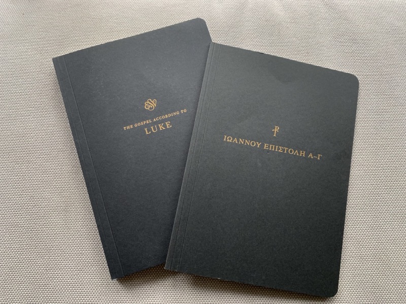
Consider, as examples, the two books pictured above, which I just purchased. The one on the left is the full text of the Gospel of Luke, printed like this:

The text is on the left page, with the right page reserved for annotation and commentary (something there’s never room enough for in a regular Bible). Note also the excellent typography, another element of book-making in which Crossway sets a standard few other publishers meet. I am very eager to begin a serious read-through of Luke with pen in hand.
The other volume is the Greek text of the three letters of John:

In this case we don’t have whole pages devoted to annotation, but rather widely-spaced lines so readers can make interlinear comments, a format ideal for noting distinctive Greek words. This one too I will soon start using.
These are simply fabulous resources for people who want to read the Bible in a serious way — a market that Crossway almost alone seems to have noticed and cultivated.